Tiny Design Critic No. 2
Including the first Tiny Design Poll! And more.
Hello from New Orleans, where I really wish my neighbors would wrap up the weed-whacking already.
Today, Tiny Design Critic returns: An occasional TAoN feature critiquing everyday, easy-to-overlook design details that seldom get attention, because sometimes it’s the little things that are worth noticing, for better or for worse.
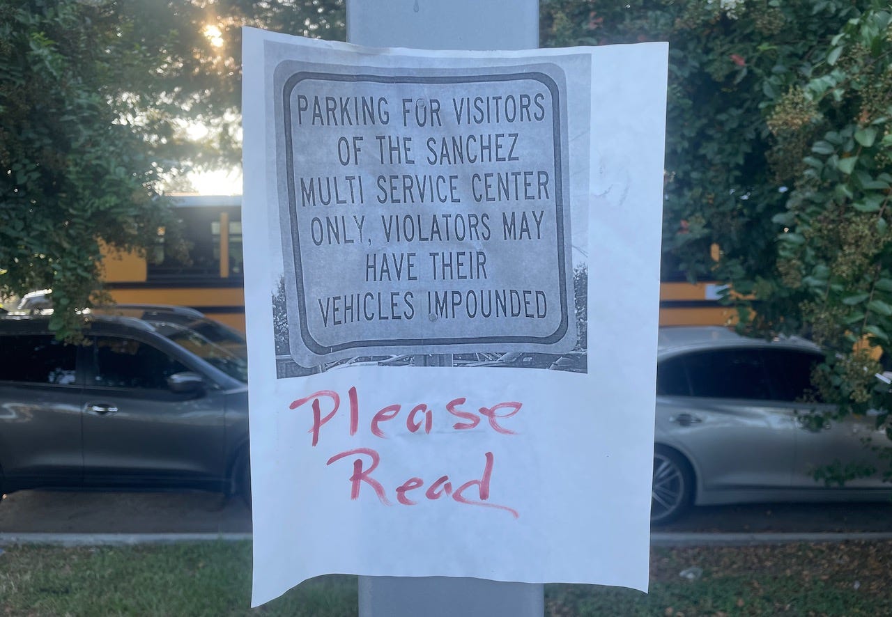
In this installment, I’ll (very briefly) assess two (possibly silly) subjects. The first is this sign.
As you can see, it’s actually a photocopy of a picture of a sign, taped to a light pole. Which by itself is kind of funny. Maybe the owner of this parking lot didn’t get enough actual signs? Can we call this a design hack? Get a real sign, people!
But what really makes this sign reproduction worth noting is that it also says, in red ink, “Please Read.” A sign that tells you to read … the sign itself. I wish I could add a little arrow-shaped sticker that said “Note this!” and pointed to the “Please Read” instruction.
On the other hand, maybe it really does make you more likely to notice the actual message? I mean, I did.
So I’ve decided to make my first use of Substack’s poll tool. Tiny Design Critic asks you: Is this “sign” bad design?
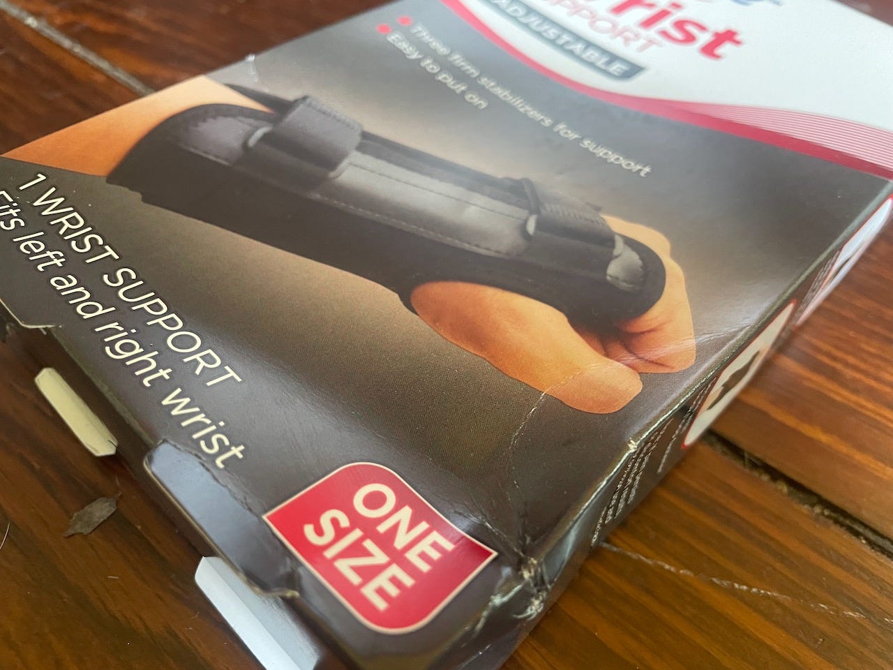
ONE SIZE
On to today’s second item. This time the focus is on a package, specifically one detail here:


